Publication DesignMARILYN MONROE
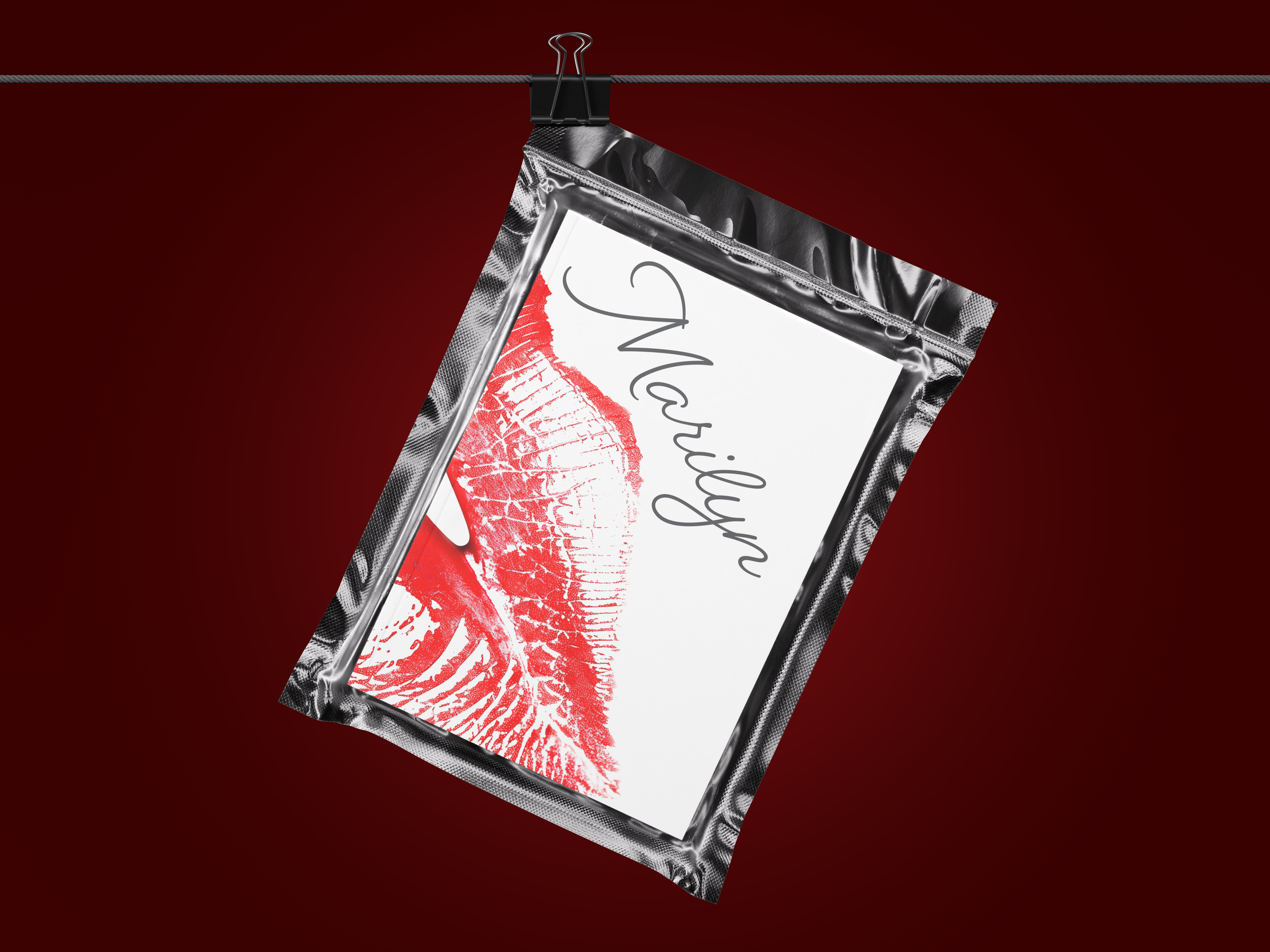
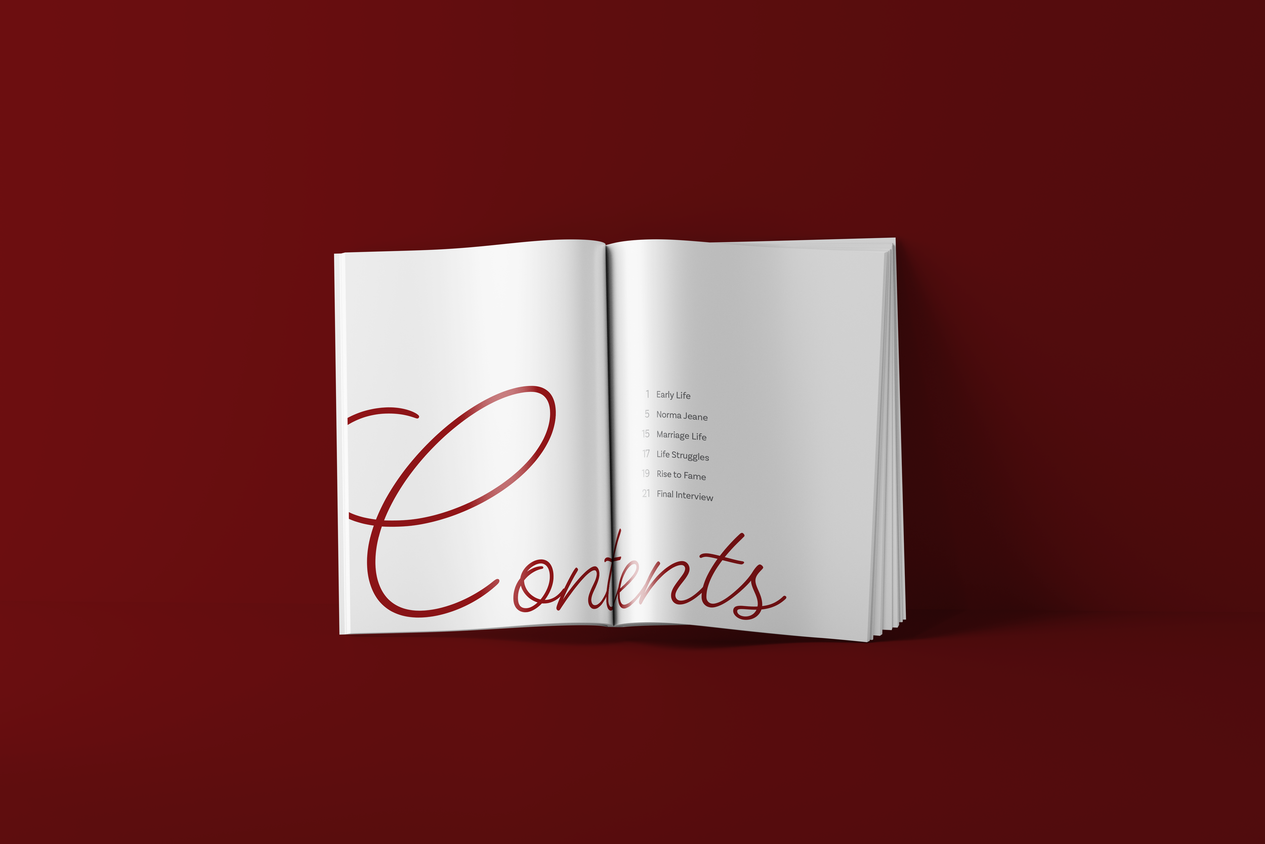
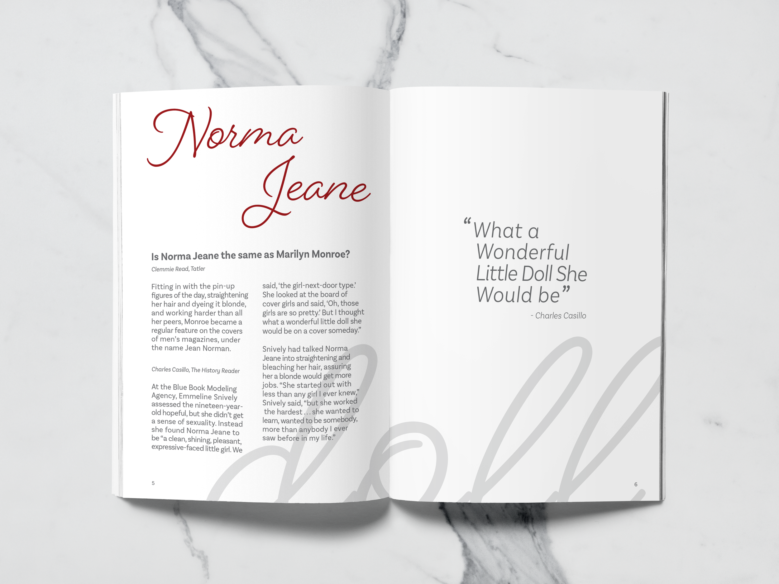
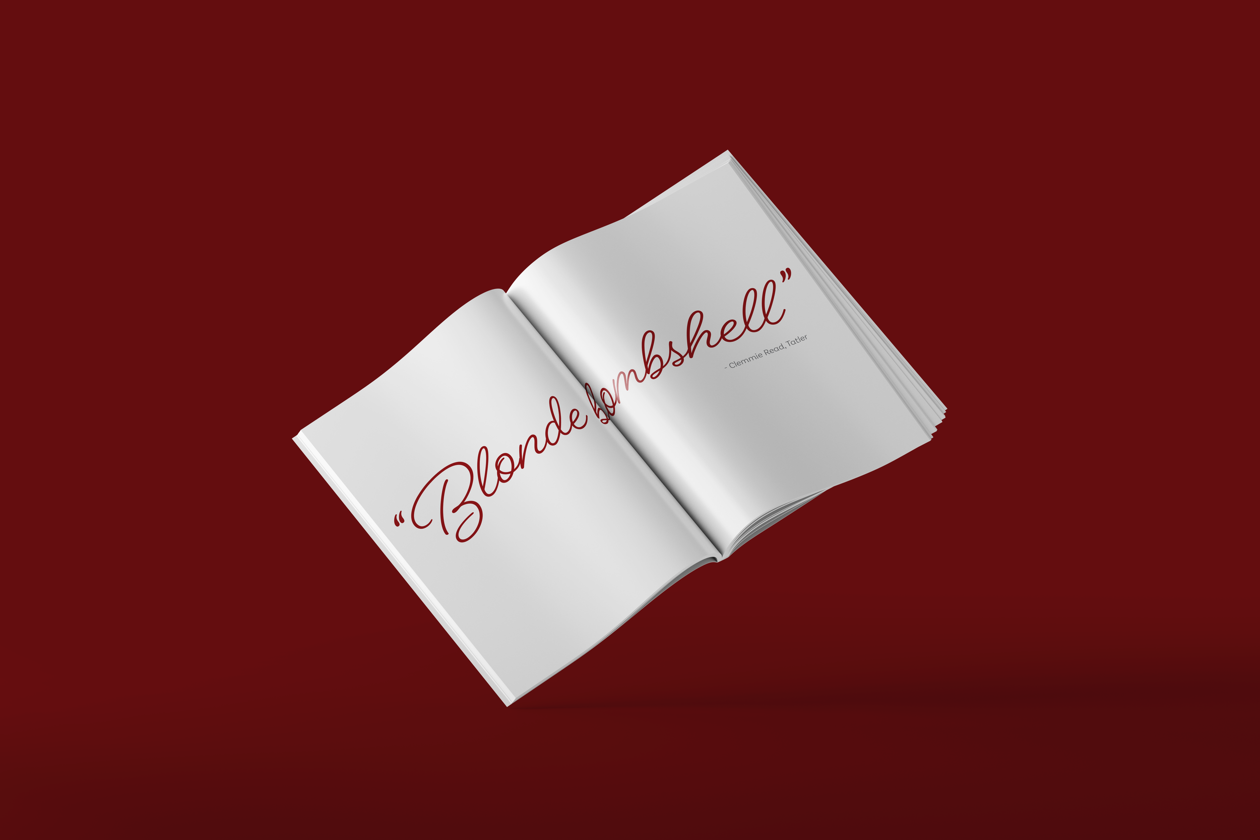
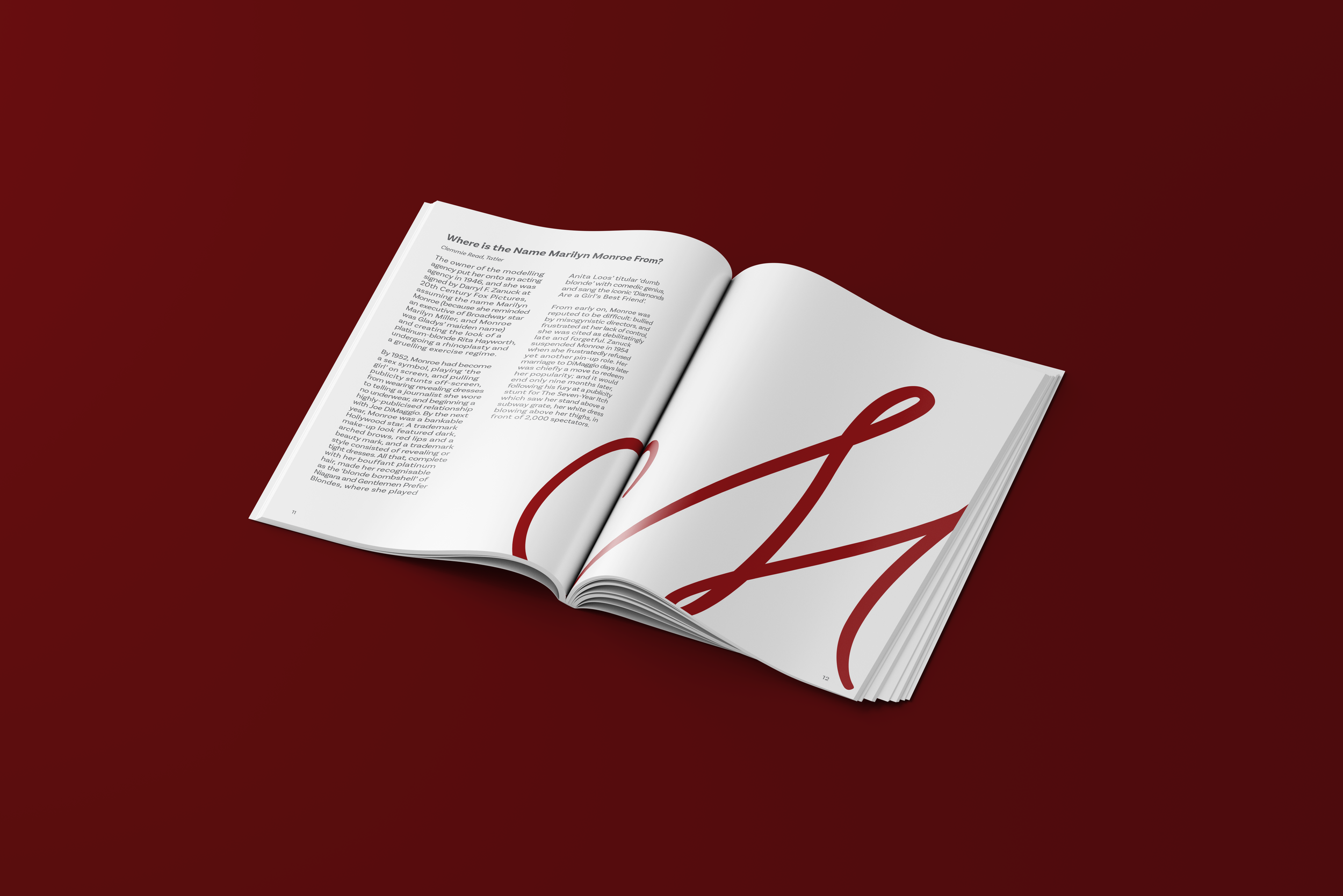
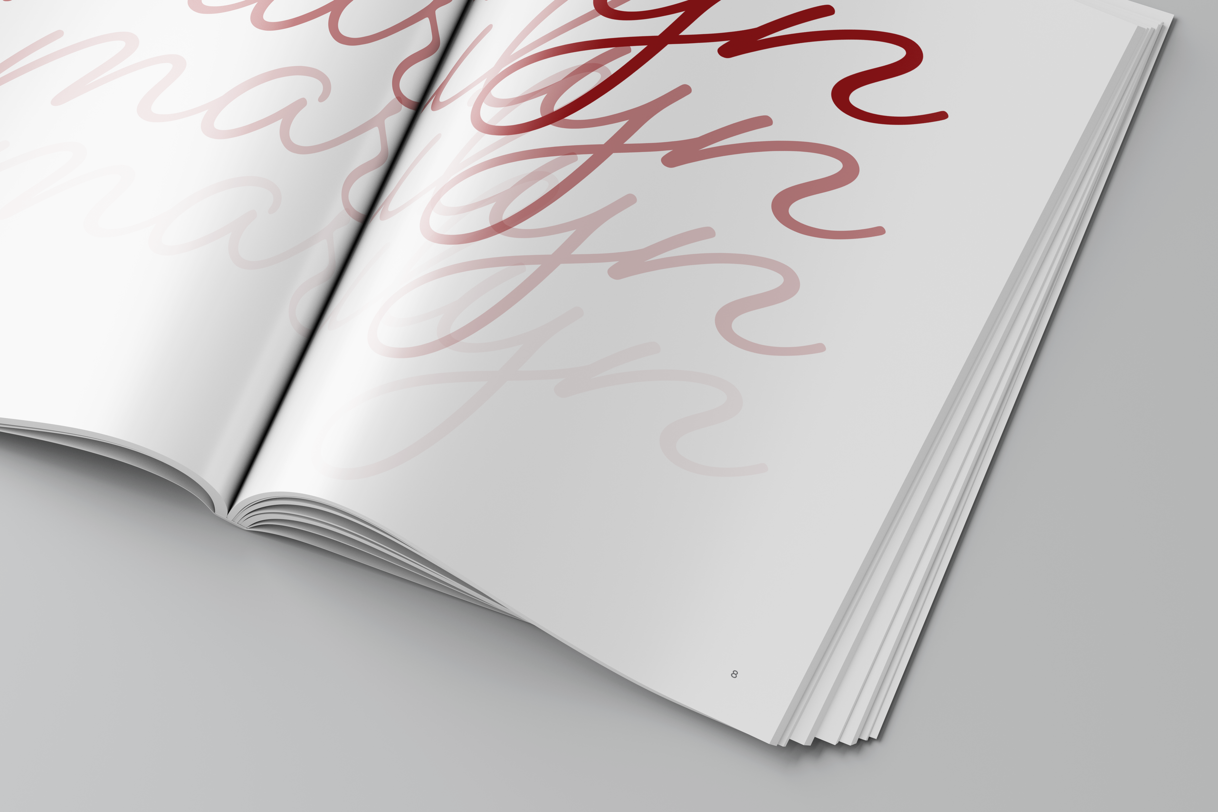
This publication explores the complexities of Marilyn Monroe’s life through bold typography and deliberate wordplay, highlighting both her public image and private struggles. Juxtaposed headlines and evocative design invite readers into a visually striking narrative of her untold story.
The luxe red, gray, and white color scheme highlights Marilyn’s iconic red lipstick and sense of style. This palette also works symbolically, with red reflecting desire and fame, while gray introduces a sense of melancholy, revealing the emotional duality beneath her image. Through layered compositions and shifting typographic hierarchy, the booklet captures the tension between the constructed “Marilyn” persona and the woman behind it, presenting her as both an icon and a complex, misunderstood individual.